

Jetpack Compose, the much-awaited UI toolkit from Google, is finally production-ready. With the power and flexibility of the declarative UI paradigm and access to low-level animation APIs, it is about to take the Android developer experience to a whole new level.
If you’re new to Jetpack Compose and declarative UI, you might want to check out the introductory post I wrote last year.
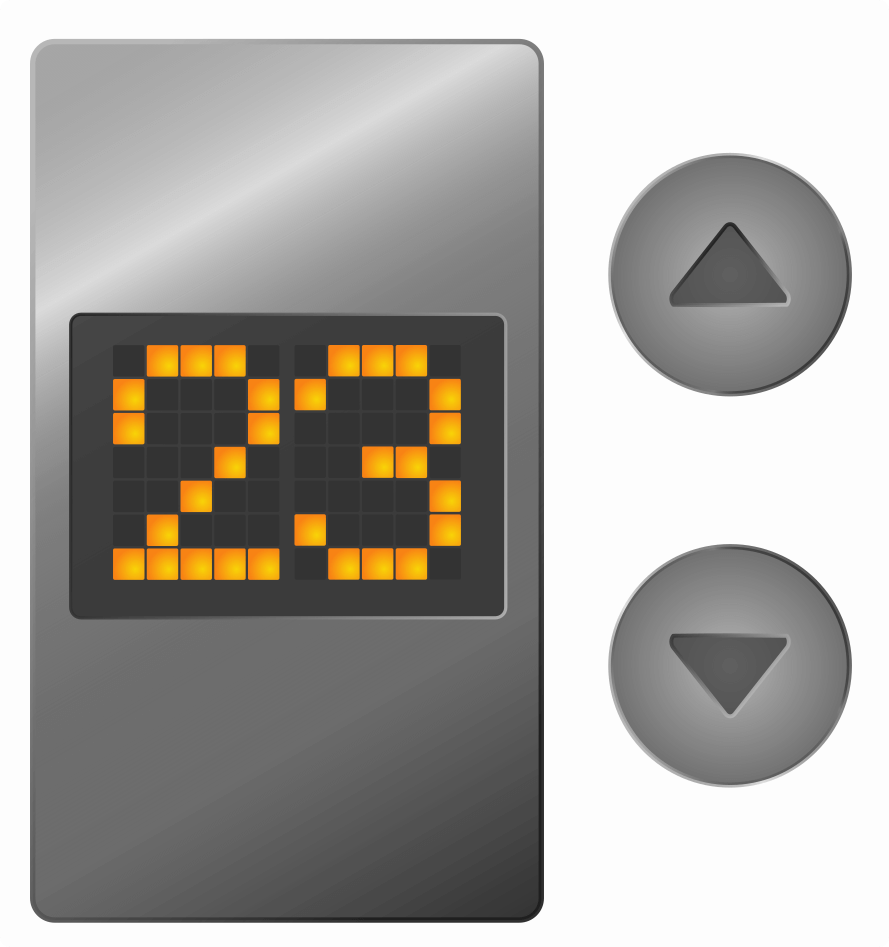
In this post, we’ll explore Jetpack Compose by building our own UI component—a 5x7 LED Matrix Display, the idea for which struck me while listlessly watching the LED display on an elevator ride. Though old, LED matrix displays are very much in vogue—take scoreboard displays, stock tickers, countdown timers, for instance.
The LED matrix display that we are going to create will:
- Support any numeral (and only numerals)
- Have numbers scrolling up and down
- Have configurable shape and color
Let’s go!
1. Getting Started
In Android Studio, create a new project by selecting the “Empty Compose Activity” template. You need the latest version of Android Studio (Arctic Fox) to work on Compose projects.
The project initializes with a simple `Greeting` composable and a `Surface` composable. To keep things simple, we won’t touch any of the theming/styles of the application; we will just remove the `Surface` and place all our code there. Also, we will show everything on the same screen.
2. Building a Grid
I’m going to use 35 `Box` composables arranged in a grid of 5 columns and 7 rows (Illustration 1):
A “composable” is a function that will emit a UI. This is equivalent to `View` in traditional XML-based system. Jetpack Compose comes with a predefined collection of composables like `Row`, `Column`, `Box`, `Button`, `Text` etc. For example, a `Row` composable is equivalent to the `LinearLayout` with horizontal orientation.
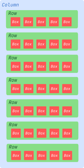
Note: There’s a composable named `LazyVerticalGrid` to build grids like this, but that API is not stable yet. So I’m sticking with the `Row` and `Column` composables for now.
Here’s how it looks:
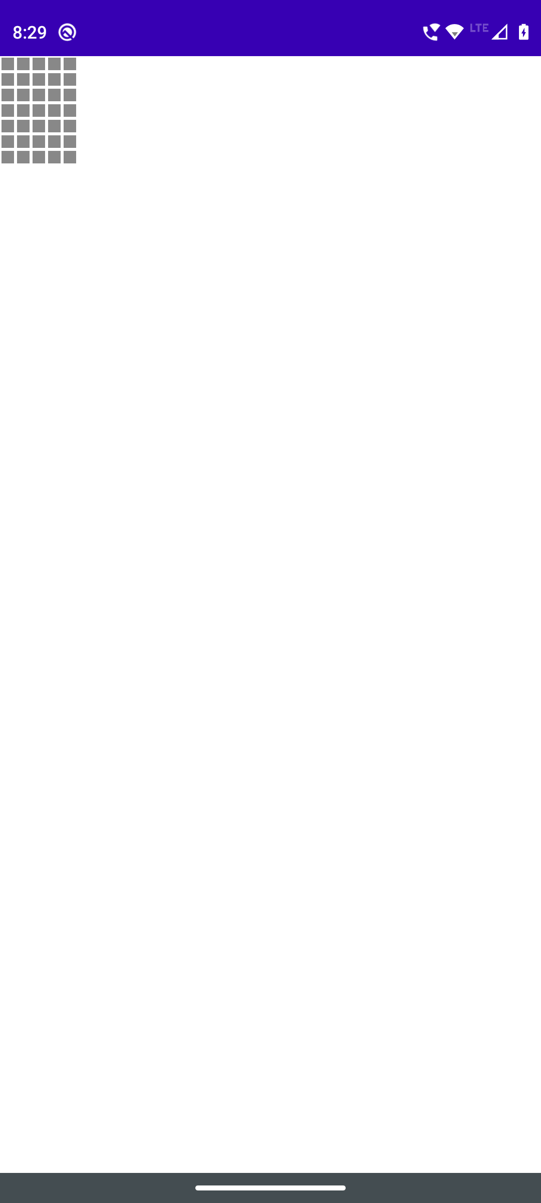
Screenshot 1: The 35 `Box` widgets in a 7x5 matrix arrangement.
Now let’s extract this matrix UI into a separate `@Composable` function to make it more manageable.
And let’s use the new composable inside the `setContent` body.
3. Adding a Character: Number “0”
Now we need to show numbers using the grid of boxes that we just created.
We can use a 5x7 matrix to represent each character internally. I’m going to use a matrix of integers, with 0 for “off” and 1 for “on” states. A matrix of booleans is a possible option, but I’m going ahead with an integer matrix because I can use other numbers to represent more LED colors, brightness level, etc., later.
Here’s an integer matrix that represents the character “slashed zero”.
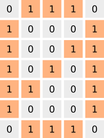
Illustration 2: Matrix representing a slashed zero.
In Kotlin, there are several ways to represent this data. I’m going to use a list of lists for this now.
4. Display the Number “0”
Now let’s update our composable function to accept a parameter `number` and traverse through the above matrix and update the color of each `Box`. In our case, we currently have only one matrix, `number00`, but we will add more later.
Build and run the code. Your application will look like this.
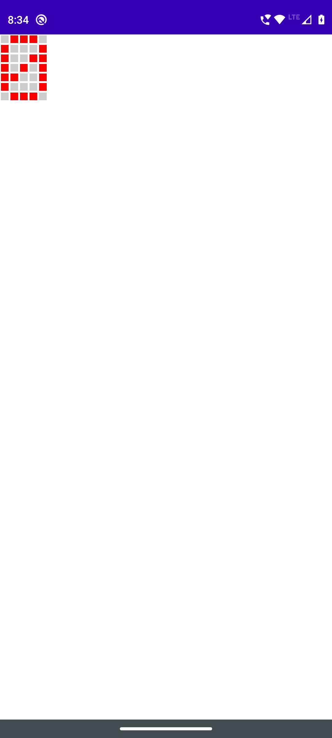
Screenshot 2: The 7x5 matrix of `Box` composables showing a slashed zero
Perfect! It’s the time to add all numbers from 0 to 9.
5. Adding Remaining Numbers
Once all the 10 matrices are added, we will update our composable to choose the matrix from the given parameter `number`. The `when` statement looks polluted. Don’t worry, we can improve this code later.
6. Switching Numbers in the Display
Now that we have all the numbers in a matrix, we can proceed to create a UI to select and show a number. Let’s add one button each for all ten numeric digits. Upon clicking a button, we can show the corresponding number on the LED display.
Enter the “state”!
A “state” is a value that can change over time. The Compose runtime can magically react to state changes and update the UI without our intervention.
Let’s introduce a state `number` with initial value 0 and update the value when each button is clicked.
In this code, a mutable state `number` is added with the `remember` function. Let me explain what happens here:
- `var number` is the variable that holds the state.
- `by` is just a Kotlin keyword to delegate instance variables (it has nothing to do with Compose).
- `remember` is a Kotlin compiler plugin API that tells the Compose runtime to cache the given value across recompositions. When `Column` recomposes the next time, `remember` will return whatever value was cached before.
- `mutableStateOf(0)` creates a mutable state variable, initializes it with 0, and returns it. The Compose runtime is intelligent enough to observe the changes to this variable and schedules a recomposition of every composable scope that reads this variable.
Let’s see the code in action.
7. Merging Matrices into a Single Matrix
To further clean up the code, we can merge the 10 different matrices into a single 5x70 matrix. I like to call it a “ribbon”.
Now let’s update the `LedMatrixDisplay` composable to use the new matrix instead of 10 different matrices. Given a value for the `number`, find the first row representing the LED state for that number in the new matrix and display 7 rows from that position, including the starting row.
For example, if the `number` is 9, then calculate the starting row of the number, which results in 63. Now use the rows from 63 to 69 to update the boxes. Nothing major here!
Running this code shows the same output because nothing has changed at the UI-level.
8. Adding Animation
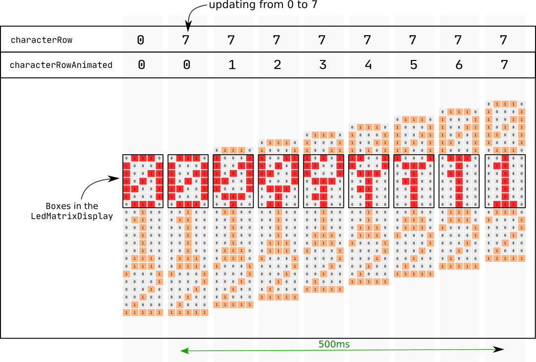
It's time to bring animation effects to our spanking new LED display. We want a scrolling effect for changing numbers and for that, we'll animate the value of `characterRow`.
For example, for number=0, the characterRow is 0, and for number = 1, the characterRow is 7. To make the LEDs “slide” the number from 0 to 1, we only need to update the value of `characterRow` from 0 to 7 in small steps.
Jetpack Compose comes with a collection of APIs to easily implement animations. The `animate*AsState()` function animates a single value as a state. We can provide the target value, and the state will animate to the new value. Each state update will trigger recompositions of composables that read this state.
In our case, we want to animate the index of a matrix, so we will use the `animateIntAsState()` function. Let’s add it.
We have specified a `tween` animation for 500 milliseconds with `LinearEasing` as the easing effect.
When the `LedMatrixDisplay` recomposes with a new value, the `characterRow` is updated to the new value. In the next line, the state `characterRowAnimated` receives this new value as the `targetValue` and starts animating towards the new `targetValue`. Since we mentioned 500 milliseconds as the duration, the value change will finish in 500 milliseconds. Since the Boxes read the value of `characterRowAnimated`, the Boxes recompose every time the `characterRowAnimated` is updated.
Here’s an illustration of this. The long vertical gray bar represents a recomposition.
Here’s how it looks in action.
The numbers stick together, so let’s add an empty line between the numbers.
Also, update the logic to access the character row inside `LedMatrixDisplay` to consider the new empty line. Again, no rocket science here.
Now the composable is ready to take any number and animate it when updated. Now we can do some code cleanup, file organization, and move the new `LedMatrixDisplay` composable to a new file with an updated color (amber—as seen on elevator displays).
That’s all! Now you have a composable that can display the given number and scroll up or down to the new number.
Example 1: Three-Digit Counter
We will add three LED Matrix displays and two buttons—one for starting/stopping the counter and another for randomizing the number.
First, we define two states: `number` to represent the number to be displayed on the counter and `started` to represent the present status of the counter.
Then we add three `LedMatrixDisplay` composables in a `Row`. Also, let’s add two buttons: one to update the value of `started` to true or false and another to generate a random value between 0 and 999 and update the `number` with it.
The three `LedMatrixDisplay` composables will recompose whenever the state that it depends on changes. In our case, whenever the value of `number` changes, the three composables will recompose with the new value.
Next, we need to start counting when the value of `started` is `true`. We can use a `while` loop with a delay for this, but again we will have to manage the threads. Luckily, Compose embraces coroutines at its core, so we can make use of coroutines and use a “side effect” to launch the coroutine.
Side Effect APIs
Composable functions should always be free of side effects, that is, they should not alter the state of an application. Since recompositions are unpredictable, modifying states within a composable function causes unexpected behavior. To update states in a predictable manner, Compose provides a set of Effect APIs. These are actually composable functions, but they don't emit any UI.
In our example, we can use a side effect named `LaunchedEffect` to run a coroutine. `LaunchedEffect` is a special composable that accepts a lambda but doesn't emit a UI. It executes the lambda in a coroutine whenever it enters the composition and cancels the coroutine when it exits the composition. This code doesn’t restart and continues execution across recompositions. If any of the arguments change, the `LaunchedEffect` will cancel the currently running coroutine and restart it. In our case, we use `LaunchedEffect(started)` to ensure that the side effect is executed every time the value of `started` is updated (from true to false and vice versa).
Inside the `LaunchedEffect(started)`, we update the value of `number` at regular intervals. If the value reaches 999, we reset it to 0. Every time `number` is updated with a new value, the three `LedMatrixDisplay` composables get recomposed with the new value, which eventually animates the display to the new value.
Styling the LED display
Now let’s make our shiny new `LedMatrixDisplay` configurable by supplying different styles. We can create a set of new classes to hold the styling information.
Update the composable to accept the new style parameter. If no style is specified, a default style is used.
Apply the style when iterating through the boxes.
Let’s move the 3-digit counter to a separate composable that works independently and accepts a style parameter.
Adding a Theme Picker
Now let’s build a “theme picker” UI to play around with different styles.
The “theme picker” UI should show a default list of colors for the "on" and "off" states, and the shape of the LED to choose from. Select the color or shape that you want to apply. The new “theme picker” composable should accept three callbacks, one each for “on” color, “off” color, and LED shape.
Now let’s add this new “theme picker” composable to the screen.
Here comes the “state” again!
We define a state `ledStyle` to keep the latest style value and initialize it with the default style. When the `ThemePicker` composable calls the lambdas, the value of `ledStyle` gets updated and the `LedCounterDisplay` gets recomposed with the new value of `ledStyle`.
Example 2: Digital Clock
Let me show you how our new component can be used to build a digital clock.
First, we will add a data class to store the time data. We will use this as a “state” in the next step.
Now let’s build a composable to represent the clock display and add the functionality to update the time every second.
I have used a state to represent time and update it every second in a `LaunchedEffect`. I hardcoded `true` as the parameter to start the lambda and run it forever. Inside the while loop, the `time = Time.getLatest()` gets called every second and all the `LedMatrixDisplay` composables get recomposed with the latest value of `time`. Also, I have gone for a custom style: black for “on” state, round shape for LEDs, and 5x5 dp dimensions.
Now let’s use the composable.
That’s all!
The `ClockDisplay` composable is self-contained and will update the time on its own.
Let’s see it in action.
Everything Together
Here’s the screen with everything together in one place.
Source Code
You can browse the latest source code of this tutorial on GitHub.
Try This Out!
Here are a few enhancements you can try out to improve your understanding of Jetpack Compose.
- Make the animation configurable.
- Add different character sets with different shapes for the numbers. Add a dependency like this:
- Add more characters like “%” and build a composable like `PercentageMatrixDisplay(percentage: Int)` that will show the percentage value using the dot matrix display.
- Right now, it takes 500 milliseconds to animate from one number to another number. Update it to 500ms for each number, that is, switching from 1 to 9 should take 4500ms. Hint: Use a `LaunchedEffect` or a `remember` with parameters.
- Try everything on a single `Canvas` instead of adding 5x7= 35 different `Box`es to the screen.