
Getting text to scale well across screen sizes takes a bit of work. Like many developers, I started with @media queries to manually adjust font sizes and spacing at different breakpoints. While it did the job, there were noticeable jumps and inconsistencies.
Fluid typography offers a smoother approach. Text can scale with the viewport using units like vw (viewport width) and functions like calc(). But without constraints, scaling can swing too far, making text too large on wide screens or too small on compact ones.
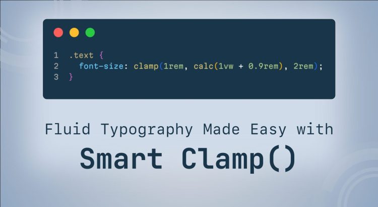
The modern clamp() function solves this by letting you define a minimum, a flexible scaling range, and a maximum value all in one line of CSS.
After constantly tweaking font sizes across projects, I thought, why not simplify the process? So I created Smart Clamp, a VS Code extension to automate clamp() function generation for perfectly scalable text. Smart Clamp takes the guesswork out of fluid typography, ensuring seamless readability across all screen sizes.
What Makes Smart Clamp Useful?
- Turns font sizes into flexible
clamp()functions instantly. - Works with
px,rem,andem,so you can integrate it smoothly into your existing workflow. - Allows scaling across viewport widths with a simple right click.
- Integrates seamlessly into your existing style sheets, making fluid typography effortless.
Smart Clamp Installation
SmartClamp can be easily installed in your Visual Studio Code and integrated into existing or new projects.
Step 1: Install Smart Clamp
- Open Visual Studio Code
- Press Ctrl+P (Windows/Linux) or Cmd+P (Mac)
- Type
ext install smartclampand hit Enter
Alternatively, search for Smart Clamp in the VS Code Extension marketplace and install it.
Step 2: Generate the Clamp Function
Select Your Font Sizes
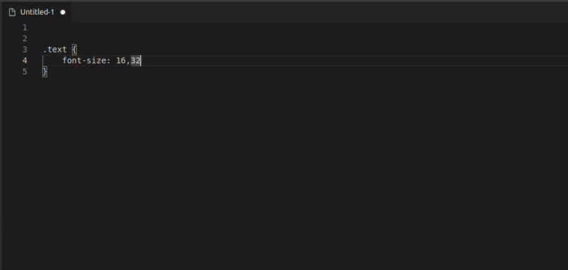
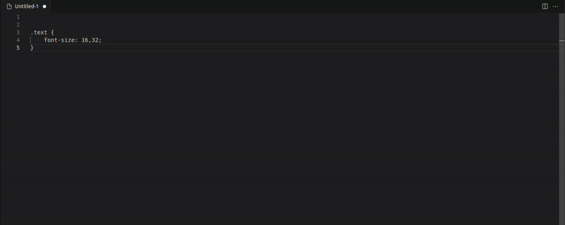
Highlight two comma-separated values to convert them into a clamp() function. Supported formats:
/* All these formats work: */

16, 24

16px, 24px

1rem, 1.5rem

1em, 1.5em
Generate a Clamp Function using one of these methods:
- Command palette (Ctrl+Shift+P / Cmd+Shift+P): Type Smart Clamp
- Right-click menu: Select Smart Clamp
- Keyboard shortcut: Ctrl+Shift+C (Cmd+Shift+C on Mac)
The generated function will look like this:
clamp(1rem, calc(0.5vw + 0.75rem), 1.5rem);/* 16px -> 24px (320px -> 1920px) */To preview the result:
- Select your values
- Right-click and choose Preview Smart Clamp
Step 3: Customize Smart Clamp Settings
Once installed, you can configure Smart Clamp globally or per project using VS Code.
- Open VS Code
- Go to File > Preferences > Settings (or Code > Preferences > Settings on macOS)
- Search for "Smart Clamp" to find the available settings
Adjust the settings as desired. These changes will apply to all projects unless overridden by a project-specific configuration.
To configure Smart Clamp for the specific project in VSCode:
- Open your project in VS Code
- Create or open the .vscode/settings.json file in the root of your project directory.
- Add your desired settings.
For example:
{
  "smartclamp.mobileScreenWidth": 375,
  "smartclamp.desktopScreenWidth": 1440,
  "smartclamp.remToPxValue": 16,
  "smartclamp.precision": 4,
  "smartclamp.outputFormat": "rem",
  "smartclamp.includeComment": false
}
These settings will override the global settings for this project only.
Configurable Settings for Smart Clamp
You can customize the following settings to control how the Smart Clamp function scales font sizes across screen widths.
Mobile and Desktop Screen Widths
smartclamp.mobileScreenWidth(default: 320): The screen width is set to 320px, meaning any screen narrower than 320px will display text at the minimum font size.smartclamp.desktopScreenWidth(default: 1920): At screen widths beyond the default 1920px, the font size no longer increases and stays at the defined maximum.
Unit Conversion and Precision
smartclamp.remToPxValue(default: 16): Defines the base pixel value used for converting px to rem. For example, if set to 16, 16px will be converted to 1rem, 32px to 2rem, and so on.smartclamp.precision(default: 2): Specifies the number of decimal places for each value in the generatedclamp()function. For instance, with a precision of 2, a value like 1.23456 will be rounded to 1.23 in the output.
Output Formating
smartclamp.outputFormat(default:rem): Specifies the unit used in the generatedclamp()values. Choose rem for root-relative sizing (recommended) or em for sizing relative to the parent element. For example, with rem selected, the output will follow this format:
clamp(1rem, calc(5vw + 0.5rem), 2rem)smartclamp.includeComment(default:true): When enabled, it appends a helpful comment to the end of the generatedclamp()function. This comment shows the original pixel values and the viewport width range used in the calculation. For example:
clamp(1rem, calc(5vw + 0.5rem), 1.5rem) /* 16px → 24px (320px → 1920px) */ For my colleagues and me, Smart Clamp has turned fluid typography into a one-click task. I hope it helps bring the same efficiency to your projects!